Basic, Style, and Agent Configuration
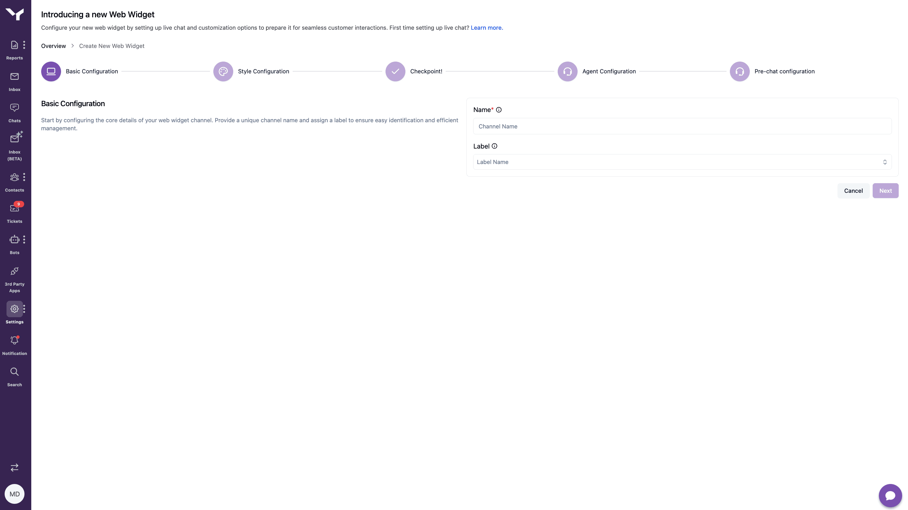
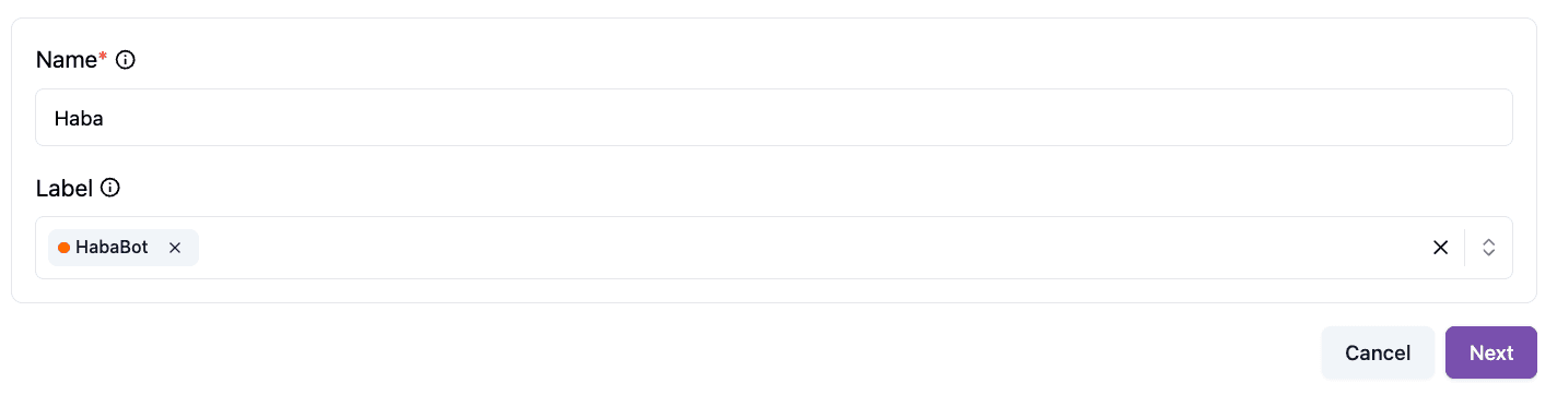
Basic Configuration
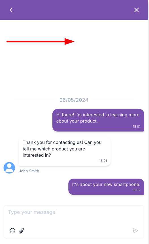
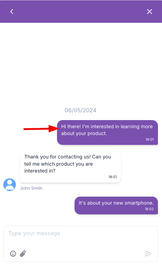
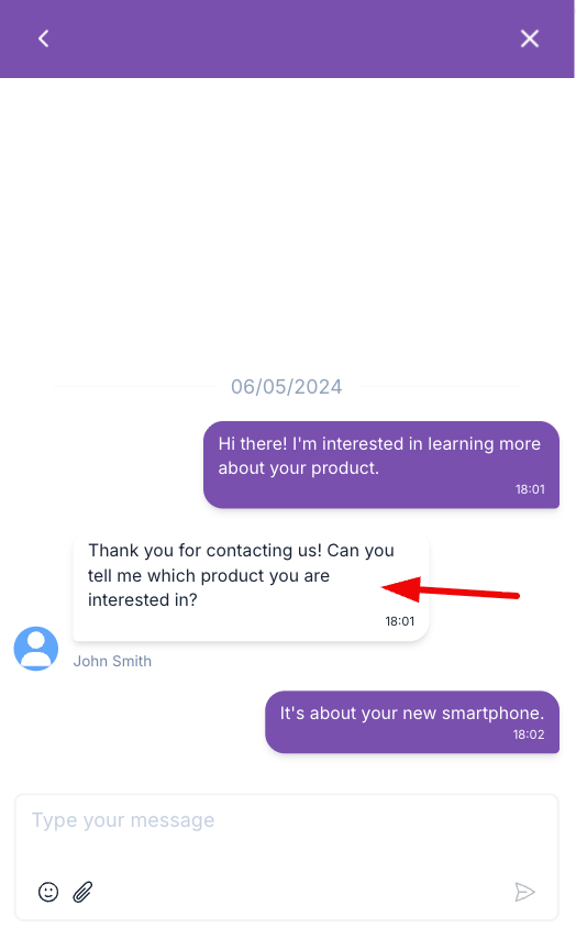
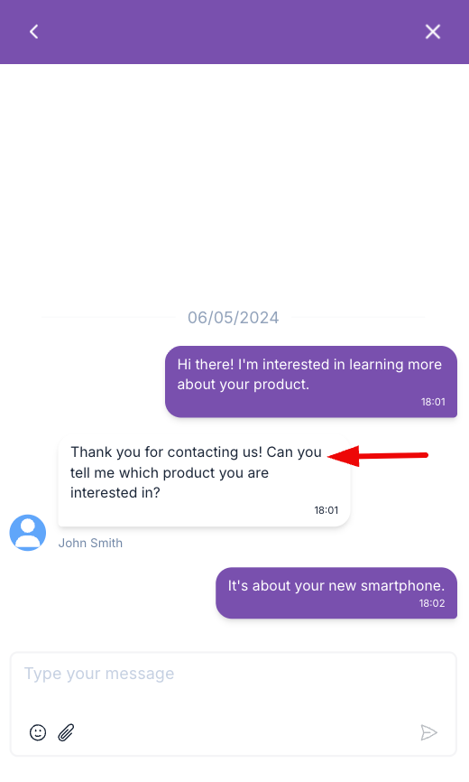
Basic Configuration defines the core identity of the web widget and how it connects to a bot. You can set the widget name for internal identification and assign a label that links the web widget to the appropriate bot. This connection ensures incoming conversations are routed correctly.
Style Configuration
Style Configuration controls the visual appearance of the web widget on your website. It allows you to adjust the widget button's position and size, as well as customize colors for the widget, home screen, and chat page, helping the widget blend seamlessly with your website design.
This is an explanation of each part.
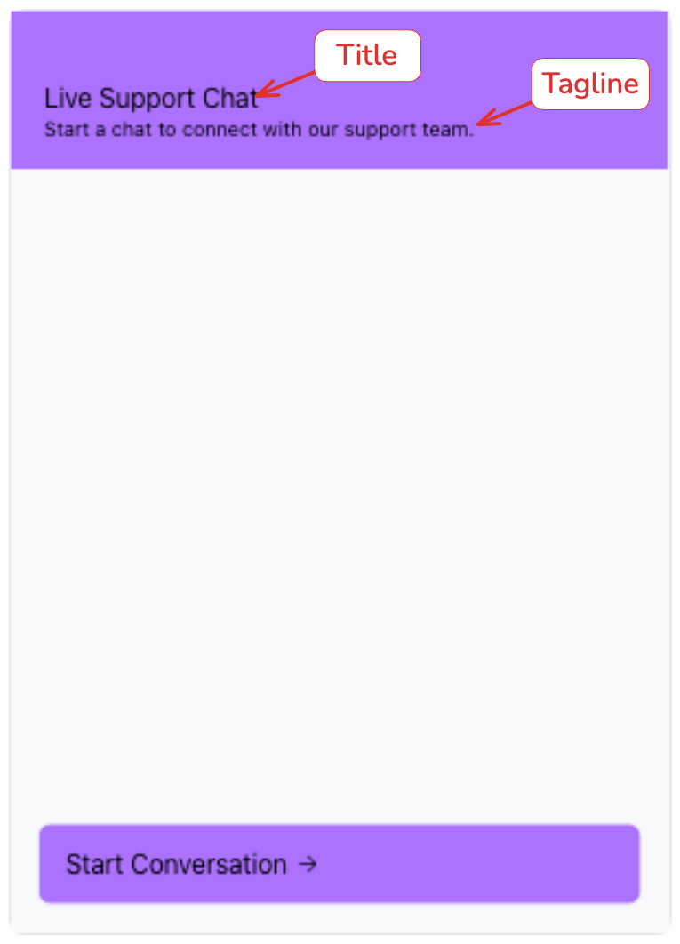
Title & Tagline

Enter a short and clear title for your web widget. This will appear at the top of the widget and should represent its main purpose.
For the tagline, provide a message to welcome users. This will appear below the title and should highlight the widget's key benefit.
Button Icon, Transparent Icon Background, Button Position
You can customize the widget icon that appears on your website or use the default icon. Enable the Transparent Icon Background toggle to remove the background color behind the chat button icon. If you upload your own icon, we recommend enabling this option to ensure the icon blends seamlessly with your website design.
You can also adjust the icon size. By default, the icon size is set to 24 × 24 px and the widget button appears in the bottom right corner of the page. While this is the most common position, we recommend choosing a placement that best fits your site's layout and design.
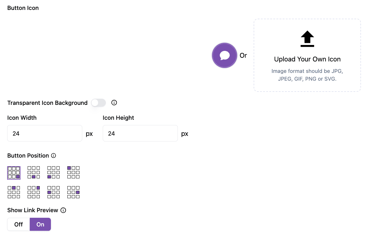
Show Link Preview
When enabled, links sent in the chatbot will display a preview with title, image, and description. Turn off to show plain links only.
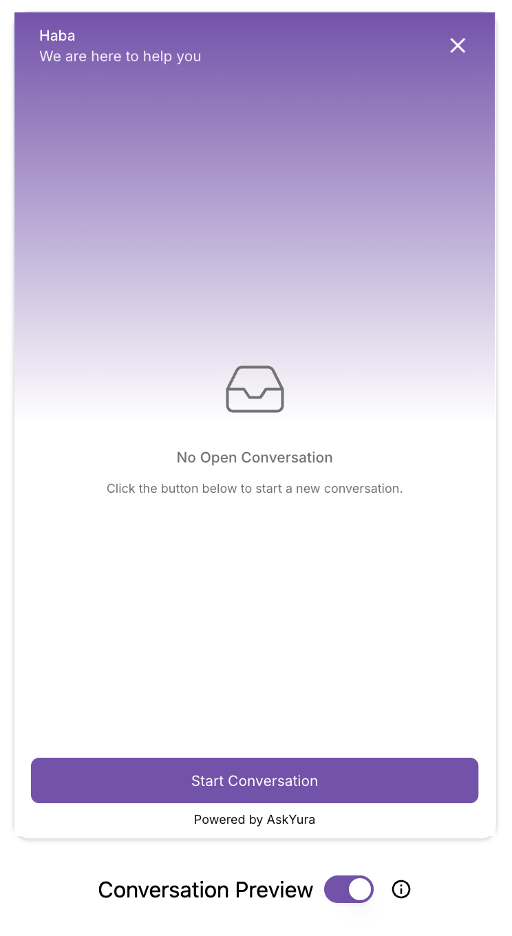
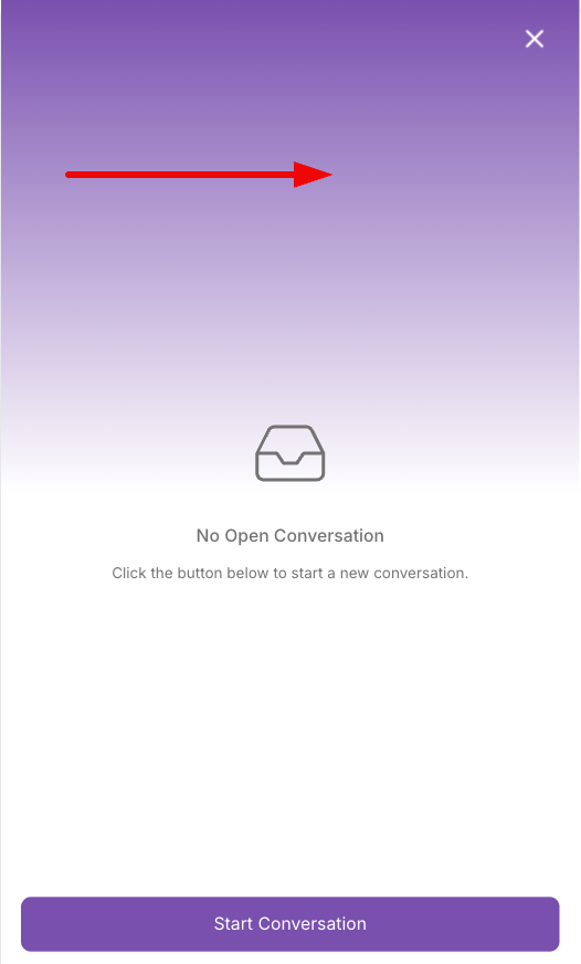
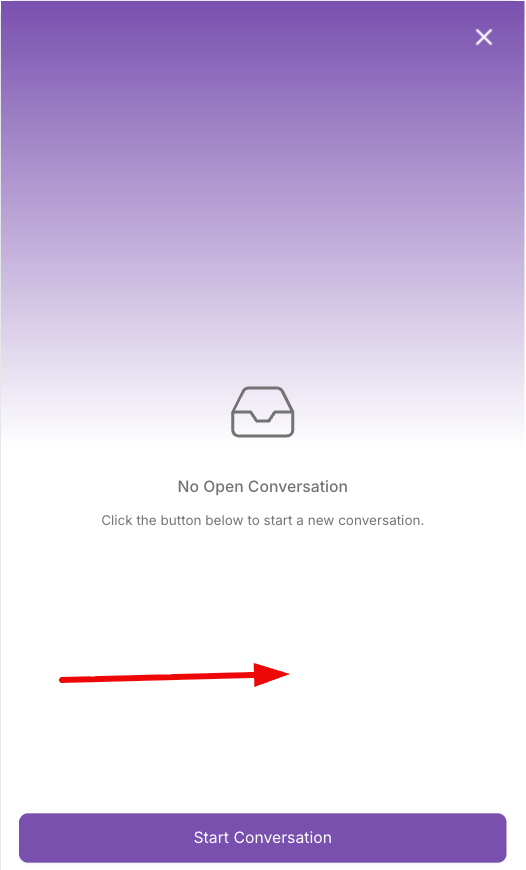
Conversation Preview
Use the toggle to switch between the button icon preview and the conversation layout preview. All changes will appear instantly in the live preview above.
Custom Widget Colors
The color customization settings are divided into three main sections, each controlling the appearance of different parts of the widget to ensure a consistent and engaging chat experience.
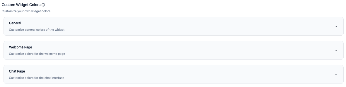
General
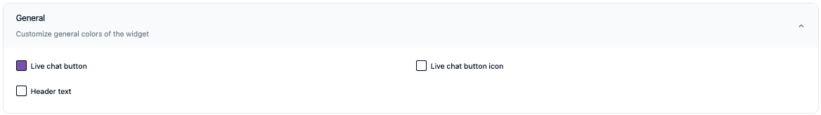
This section allows you to customize the main colors of the widget, including live chat button, live chat button icon, and header text. These colors represent the primary identity of the widget and are visible before the chat is opened.
Here are the details of each color
-
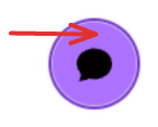
Live chat button
-
Live chat button icon
-
Header text
Welcome Page
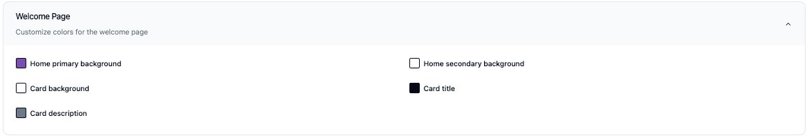
This section allows you to controls the appearance of the welcome page, which is the first screen customers see when they open the widget. You can customize elements such as the primary and secondary background colors to create a welcoming first impression.
Here are the details of each color
-
Home Primary Background
-
Home Secondary Background
-
Card Title
-
Card Background
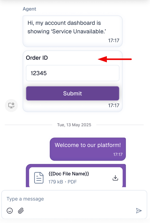
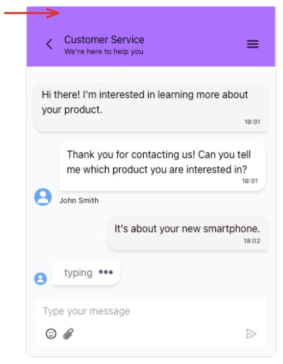
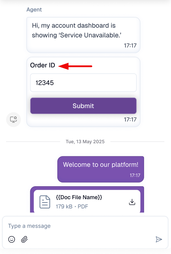
Chat Page
This section focuses on the chat interface. You can customize the chat background, as well as the bubble and text colors for both agent and customer messages, ensuring the conversation remains clear and visually comfortable.
Here are the details of each color
-
Chat background
-
Customer bubble

-
Customer text
-
Agent bubble
-
Agent text
-
Form button
-
Form button text
Design tips:
- Use your main brand color for the chat button to make it look consistent.
- Make sure the text is contrasting enough with the background to make it easy to read.
- Turn on the Conversation Preview feature on the right just below the widget view simulation, to see a sample result. Then you can start simulating interacting with the widget.
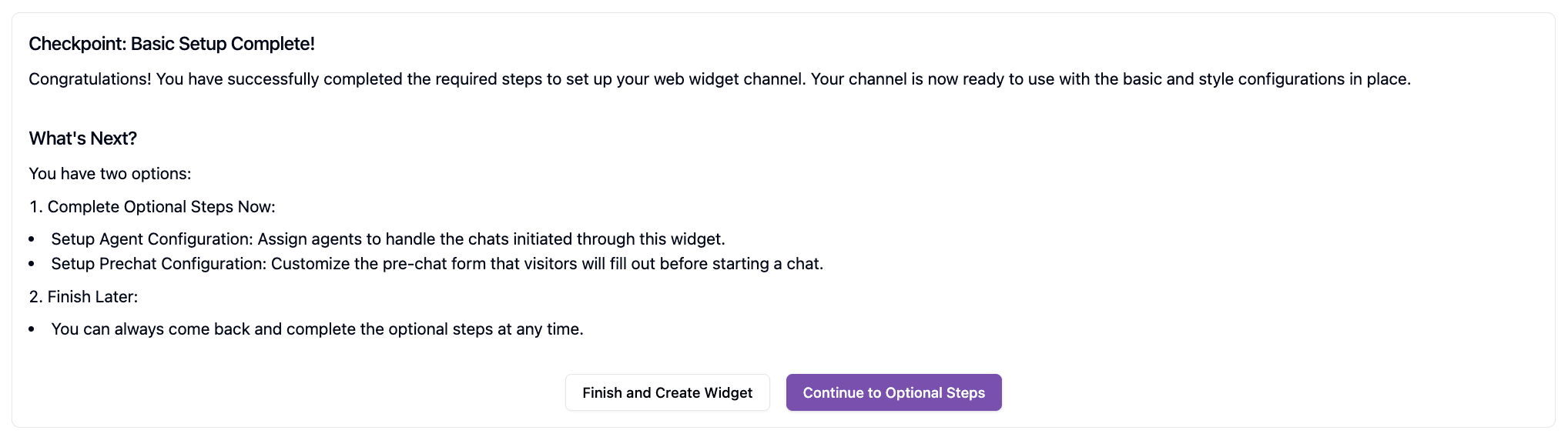
A web widget can be created and used by completing only the Style Configuration, as other settings will follow the default configuration. However, to ensure optimal routing, consistent branding, and a better customer experience, it's recommended to review and configure all sections before publishing the widget.
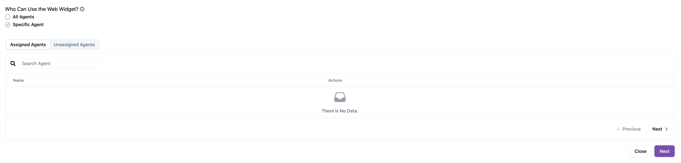
Agent Configuration
Agent Confirmation determines which agents can access and handle conversations coming from the web widget. By default, all agents in the workspace can access it, but this setting can be adjusted to restrict access to selected agents only.